Step 1: Get air quality data into Home Assistant
Everything on a dashboard starts as an entity, so the first job is getting a PM2.5 or CO₂ entity into Home Assistant. There are two paths, depending on whether you own hardware.
If you own a sensor
Most consumer monitors have a well-trodden route in:
- AirGradient. The official AirGradient integration talks to your monitor over the local network. Add it under Settings → Devices & Services.
- IKEA air quality sensors (ALPSTUGA, VINDSTYRKA). Join them via Zigbee or Matter like any other IKEA device.
- Awair, PurpleAir. Both have integrations that expose their readings as sensor entities.
- ESPHome builds. A PMS5003 or SCD40 wired to an ESP32 shows up like any ESPHome device, with entities you name yourself.
If you don’t own a sensor
You don’t need to buy anything to start. The AirGradient map has thousands of public outdoor sensors sharing live readings, and the free AirGradient Public integration follows any of them, including the one two streets away that you don’t have to own. Find a location on the map, note its location ID, install the integration through HACS, and you get PM2.5, PM10, US AQI, CO₂, temperature, humidity, TVOC and NOx as normal entities. No account, no API token.
Step 2: Find your sensor entities
Open Developer Tools → States and search for pm or co2. You’re looking for entity IDs like:
sensor.living_room_pm2_5      → 6.2   (µg/m³)
sensor.living_room_co2        → 743   (ppm)
sensor.outside_air_pm2_5      → 11.8  (µg/m³)
Confirm the units: PM2.5 should report in µg/m³ and CO₂ in ppm. If a PM2.5 entity reports an AQI number instead (0–500 scale, unitless), it’s a different measure, and most cards want the raw concentration.
Step 3: Put it on a dashboard card
The zero-install option
Home Assistant’s built-in Gauge card (with severity colours) and History graph card need nothing extra and are a fine start. Their limitation is interpretation: they show you 11.8, and leave “…is that bad?” to you.
A card that interprets for you
That interpretation layer is exactly what purpose-built cards add. The free, open-source Air Quality Scene Card renders your sensor as an animated scene (sky, hills, and a mascot whose mood follows the air quality) coloured to the US EPA categories, with a tap-to-expand history view (24-hour chart, 10-day heatmap, WHO-guideline comparison) built from Home Assistant’s own recorder. No cloud, no account.
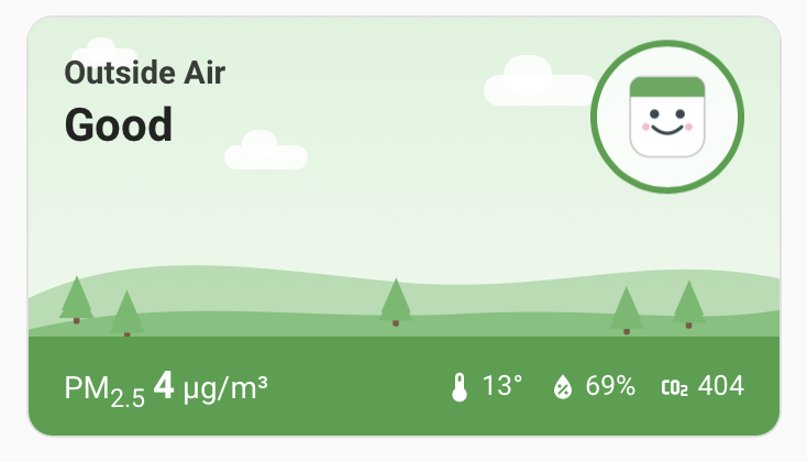
Installing it takes about two minutes:
- Open the repo in HACS as a Dashboard repository and click Download. No restart needed.
- Add “Air Quality Scene Card” from the dashboard card picker (hard-refresh the browser once).
- Pick PM2.5 or CO₂ as the primary reading and choose your entity. Temperature, humidity and the other pollutant are auto-discovered.
Comparing options first? See the 5 best Home Assistant air quality cards, which covers this card and four alternatives honestly.
Step 4: Know what the numbers mean
The US EPA’s 2024 AQI breakpoints for PM2.5 (24-hour average):
| Category | PM2.5 (µg/m³) | What it means |
|---|---|---|
| Good | 0 – 9.0 | Enjoy it. The WHO’s annual guideline of 5 sits in here too |
| Moderate | 9.1 – 35.4 | Fine for most; sensitive people may notice |
| Unhealthy for Sensitive Groups | 35.5 – 55.4 | Asthma, heart conditions, kids, older adults: take it easy outside |
| Unhealthy | 55.5 – 125.4 | Everyone: reduce prolonged outdoor exertion |
| Very Unhealthy | 125.5 – 225.4 | Stay inside with filtration if you can |
| Hazardous | 225.5+ | Emergency conditions, wildfire-smoke territory |
For CO₂, which tracks ventilation rather than pollution: outdoor air sits around 420 ppm, under ~800 ppm a room feels fresh, 1000 ppm is the classic open-a-window line, and above 2000 ppm most people report stuffiness and poorer concentration.
Step 5 (optional): Automate on it
Once the data is flowing, the dashboard is only half the value. A simple numeric-state automation warns you when air quality slips, and the for: clause avoids alerts on momentary spikes like cooking:
alias: Warn when PM2.5 goes above Moderate
triggers:
  - trigger: numeric_state
    entity_id: sensor.living_room_pm2_5
    above: 35.4
    for: "00:10:00"
actions:
  - action: notify.mobile_app_your_phone
    data:
      title: Air quality alert
      message: >-
        PM2.5 is {{ states('sensor.living_room_pm2_5') }} µg/m³.
        Close the windows.
The same trigger can switch a smart plug running an air purifier, with a matching below: 9.0 automation to turn it off again.
Frequently asked questions
Can I add air quality to Home Assistant without buying a sensor?
Yes. The AirGradient map has thousands of public outdoor sensors sharing live data. The free AirGradient Public integration follows any of them. You enter a location ID from the map and get PM2.5, CO₂, temperature and more as normal Home Assistant entities, no account or API token needed.
Which air quality sensors work with Home Assistant?
Most consumer monitors do: AirGradient (official local integration), IKEA's air quality sensors (Zigbee/Matter), Awair, PurpleAir, and any ESPHome build with a PM2.5 or CO₂ sensor attached. If it exposes a sensor entity in Home Assistant, you can put it on a dashboard.
What PM2.5 level is unhealthy?
Under the US EPA's 2024 AQI breakpoints, 0–9.0 µg/m³ is Good, 9.1–35.4 is Moderate, 35.5–55.4 is Unhealthy for Sensitive Groups, and anything above 55.5 µg/m³ is Unhealthy for everyone. The WHO annual guideline is stricter: 5 µg/m³.
What CO₂ level means I should ventilate?
Outdoor air is roughly 420 ppm. Under about 800 ppm a room feels fresh; 1000 ppm is the classic open-a-window line; above 2000 ppm most people report stuffiness and reduced concentration.
Do I need a custom card, or is the built-in gauge enough?
The built-in gauge and history cards work fine and need no installs. A purpose-built card adds the interpretation layer (EPA/WHO categories, colour, history heatmaps) so a glance tells you the answer instead of a raw number.